BEDFORD EDGE
final logo
After a few rounds of logo designs, the final logo for the project was chosen.
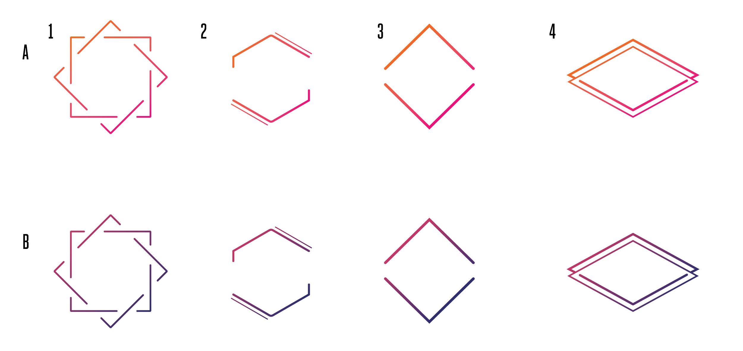
The concept.
A New Development rental building needed a logo. The building was right off the corner of Bed-Stuy and Clinton Hill and only a few blocks away from the Pratt Institute. The idea was to capture the art community/students; therefore, two different color palettes were chosen for the logo concepts.

the design.
At first, the team was between two names to use for the building - the address (1044 Bedford Avenue) or Bedford Commons. I designed logo concepts for both options using the two different color palettes chosen for the project.
After the initial round of concepts, the team came back and asked for concepts with a different name, Bedford Edge.
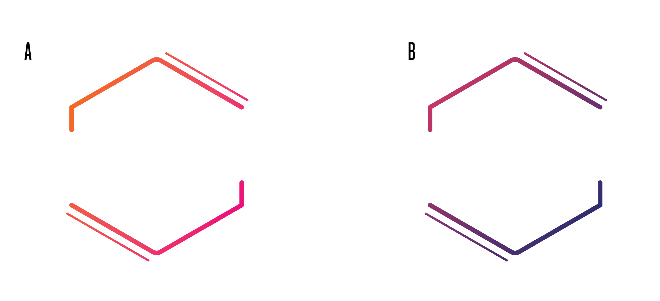
After delivering logo designs for Bedford Edge, they asked for one more round in which they wanted the font used for option 3 to be used in the logo design for option 2.